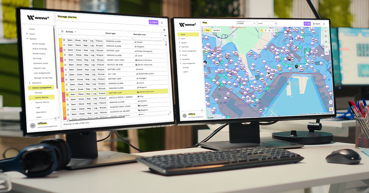
A shared fleet management dashboard should not be just a screen full of numbers. For a micromobility operator, it is the tool that helps understand what is happening across the fleet every day, where action is needed and which decisions can improve availability, utilization, costs and revenue.
Electric scooters, e-bikes and other shared vehicles generate continuous data: location, battery status, rides, technical alerts, idle vehicles, high-demand areas, economic performance and field team activities. The value does not come from the amount of data available, but from the ability to turn that data into operational actions.
A good shared fleet management dashboard should help the team answer practical questions: how many vehicles are truly ready for rental? Which vehicles are staying idle? Where is availability too low? Which areas are generating the most revenue? Which interventions should be prioritized today?
Why a shared fleet management dashboard improves decisions
An effective shared fleet management dashboard reduces improvisation. Without a clear view of operational data, many decisions are based on team experience, user reports or urgent issues that emerge during the day. Experience remains important, but it becomes far more useful when supported by clear data.
Otherwise, the risk is to intervene too late, move vehicles that are not a priority, ignore technical alerts or leave vehicles available only in theory. In a shared fleet, a vehicle may appear in the system, but still be of little value if it is in the wrong area, has insufficient battery or has not been rented for too long.
Forbes, in an article on the role of custom dashboards, highlights how data visualization can help companies monitor KPIs and performance in a more useful way for decision-making. For a shared mobility fleet, this principle becomes operational: a dashboard should not simply collect numbers, but help the team read the most important data and turn it into daily decisions.
From data to operational priorities
The first goal is to separate what is urgent from what is only informative. A useful dashboard should allow the team to immediately see:
- critical issues, such as unavailable vehicles, technical errors or low battery;
- operational opportunities, such as high-demand areas with few available vehicles;
- economic signals, such as a drop in average revenue or low vehicle productivity;
- recurring anomalies, such as vehicles often idle in the same area.
When these data points are displayed clearly, the team can decide where to focus its work. This reduces downtime, unnecessary interventions and non-priority activities.
Operational data to monitor every day
The first section of a shared fleet management dashboard should focus on the operational status of the fleet. These are the data points that help understand whether the service is truly ready to operate during the day.
The main indicators are:
- vehicles available for rental;
- vehicles unavailable due to battery, maintenance or alerts;
- vehicles currently in use;
- vehicles idle beyond a defined threshold;
- vehicle distribution by area.
These numbers provide an immediate snapshot of the fleet. If many vehicles are available but not being used, the issue may be location. If many vehicles are blocked by alerts or low battery, the priority becomes technical and operational.
A common mistake is to consider everything online as truly available. In reality, a vehicle may be visible in the system but not ready to generate a ride. It may have low battery, be located in a low-demand area, have an unresolved alert or remain poorly visible to users.
This is why the dashboard should distinguish between formal availability and real availability. A vehicle ready for rental is not just a point on the map. It is a vehicle that can be found, unlocked and used by a customer.
This distinction becomes especially important when working on inactive vehicles in shared mobility fleets, because it helps identify which vehicles are staying idle and which actions can bring them back to revenue.
Economic KPIs: revenue, utilization and margin
A shared fleet management dashboard should not be limited to technical data. It should also help read the economic performance of the fleet. Knowing where vehicles are is important, but knowing how much they are generating is even more important.
Daily economic KPIs should include:
- total daily revenue;
- average revenue per vehicle;
- average revenue per ride;
- number of rides per vehicle;
- utilization rate;
- operating costs by area or intervention.
These data points help understand whether the fleet is growing sustainably. One area may generate many rides, but also require frequent recovery, charging or repositioning. Another may generate fewer rides, but show a better balance between revenue and costs.
Revenue per vehicle and utilization rate
Two indicators deserve daily attention: revenue per vehicle and utilization rate. The first shows how much each vehicle contributes to the economic result. The second indicates how much it is used compared with its availability.
If a vehicle has a low utilization rate and generates little revenue, the operator needs to understand whether the issue is location, pricing, visibility or technical status. If a vehicle is used often but produces low margin, the issue may be related to pricing, average ride duration or connected operating costs.
The dashboard becomes truly useful when these data points are not isolated. The team should be able to read them together and decide whether to act through rebalancing, maintenance, pricing or promotional actions.

Areas, demand and time-based decisions
Geographical distribution is one of the most important elements in a shared fleet management dashboard. A fleet may have enough vehicles overall, but still be inefficient if those vehicles are not in the right places.
Every day, the operator should check:
- which areas have high demand and few available vehicles;
- which areas accumulate unused vehicles;
- where rides concentrate across different time slots;
- which zones require more operational interventions;
- which areas should be covered even if they generate lower revenue.
This view helps avoid two opposite mistakes: moving too many vehicles without real need or leaving high-demand areas uncovered when they could generate immediate rides.
Demand changes throughout the day
An effective dashboard should not only show daily averages. Demand changes during the day. Stations, universities, business districts, tourist areas and residential neighborhoods behave differently.
One area may be highly relevant in the morning and almost irrelevant in the evening. Another may work mainly during weekends. Without time-slot analysis, operators risk making decisions that are correct in theory but wrong in practice.
When this analysis is integrated with dynamic pricing for micromobility, the dashboard can help evaluate whether rates, packages or incentives are actually improving utilization and margin in underperforming areas.
Alerts, maintenance and team activities
A shared fleet management dashboard should also support field team coordination. It is not enough to know that a vehicle has a problem. The team needs to understand who should intervene, with what priority and when.
The most important alerts include:
- low battery or vehicle not ready for rental;
- technical errors or recurring reports;
- vehicles idle for too long;
- anomalous or potentially problematic rides;
- open tasks and incomplete interventions.
These data help move from reactive management to a more structured approach. The team can work on clear priorities, reduce unnecessary trips and intervene before a problem causes service issues or lost revenue.
Assignable and trackable tasks
A truly operational dashboard should show not only the problem, but also the connected action. If a vehicle needs to be recovered, charged, checked or repositioned, the task should be assignable to an operator and trackable until completion.
This is especially important as the fleet grows or when the service operates across multiple cities. Without clear task management, information gets scattered across chats, calls and notes. The result is wasted time and lower operational control.
The role of Wevie in the shared fleet management dashboard
To build a truly useful shared fleet management dashboard, operators need a platform that connects data, vehicles, areas, alerts and operational activities. Wevie can support rental operators in this direction by offering tools to monitor vehicles in real time, read statuses, errors and alerts, manage zones and geofencing, organize tasks for operators and analyze fleet data.
The value is not simply having a map or a vehicle list. The value lies in turning information into decisions: understanding which vehicles are available, which are idle, which require intervention, which areas are performing better and where action is needed to improve utilization and profitability. For an operator, this means reducing manual work, improving team coordination and making daily management more controllable.
To evaluate how these logics can be applied to your service, you can request a Wevie demo and explore how the platform supports fleet operations.
From numbers to daily decisions
A shared fleet management dashboard works when it helps the team decide, not when it simply shows more data. Numbers should point to priorities, risks and opportunities. They should help identify which vehicles to move, which to check, which areas to cover and which economic metrics are improving or worsening.
For a broader view of these elements, the path dedicated to shared micromobility profitability and fleet operating margins connects dashboard, utilization rate, revenue, costs, maintenance, pricing and operations in a single management view.
The decisive step is to use the shared fleet management dashboard as a daily working tool, not as a report to consult occasionally. When data is read consistently, it becomes a practical guide to improve the service, reduce inefficiencies and make faster, more informed operational decisions.